Case Study:
Branding for Herbs, the spice company 🌿
Brand Identity / Strategy / Package Design
Overview
Herbs is a wellness brand built around the power of nature, aiming to make herbal remedies accessible, trustworthy, and modern. The project involved creating a visual identity and digital presence that reflected both authenticity and a fresh, contemporary appeal.
Herbs is a contemporary spice brand built on a simple philosophy: a single spice or a thoughtful blend has the power to transform any dish. My task was to create a brand identity and packaging system that captured this philosophy while keeping the design clean, modern, and approachable.

To begin, I conducted extensive research to understand the wellness and herbal landscape. The focus was on uncovering customer expectations, identifying trends in branding, and exploring how similar businesses communicate their values.
Research & Insights
The central idea was fusion in its simplest form, illustrating how flavour and nature come together.
Competitor Analysis
In the early stages of the project, I carried out a thorough competitor analysis to map both direct and indirect competitors in the wellness and herbal products space. Direct competitors included brands offering herbal remedies, teas, and natural supplements, where the focus was on packaging, visual identity, and user experience across digital platforms. Indirect competitors extended to lifestyle and wellness brands that, while not purely herbal, positioned themselves around concepts of natural living, sustainability, and mindful consumption. This dual perspective helped identify gaps in the market, opportunities for differentiation, and visual strategies that could make Herbs stand out while still feeling relatable to its audience.
Direct competitors were herbal-first brands (teas, supplements, apothecary) with strong provenance and organic claims. Indirect competitors influenced audience expectations around ‘natural’, ritual, and ethical positioning across beauty and lifestyle. Mapping both groups clarified where Herbs could own a warmer, modern-apothecary look with clearer functional benefits and a calmer palette.
Moodboard Development
To shape the design direction, I curated a moodboard that drew inspiration from natural textures, muted earthy tones, botanical illustrations, and contemporary minimal aesthetics. The aim was to capture a balance between authenticity and modern appeal, making Herbs feel both trustworthy and aspirational. After sharing the moodboard with the client, their feedback was overwhelmingly positive. They felt it resonated with the brand’s vision and appreciated how it translated abstract values like freshness, wellness, and simplicity into a tangible visual language. The client’s reaction reinforced the chosen direction and gave us a strong foundation for building the visual identity.
This analysis revealed opportunities for Herbs to adopt a clean, approachable identity while differentiating itself through warmth, trust, and a touch of modern minimalism.
Competitor Analysis
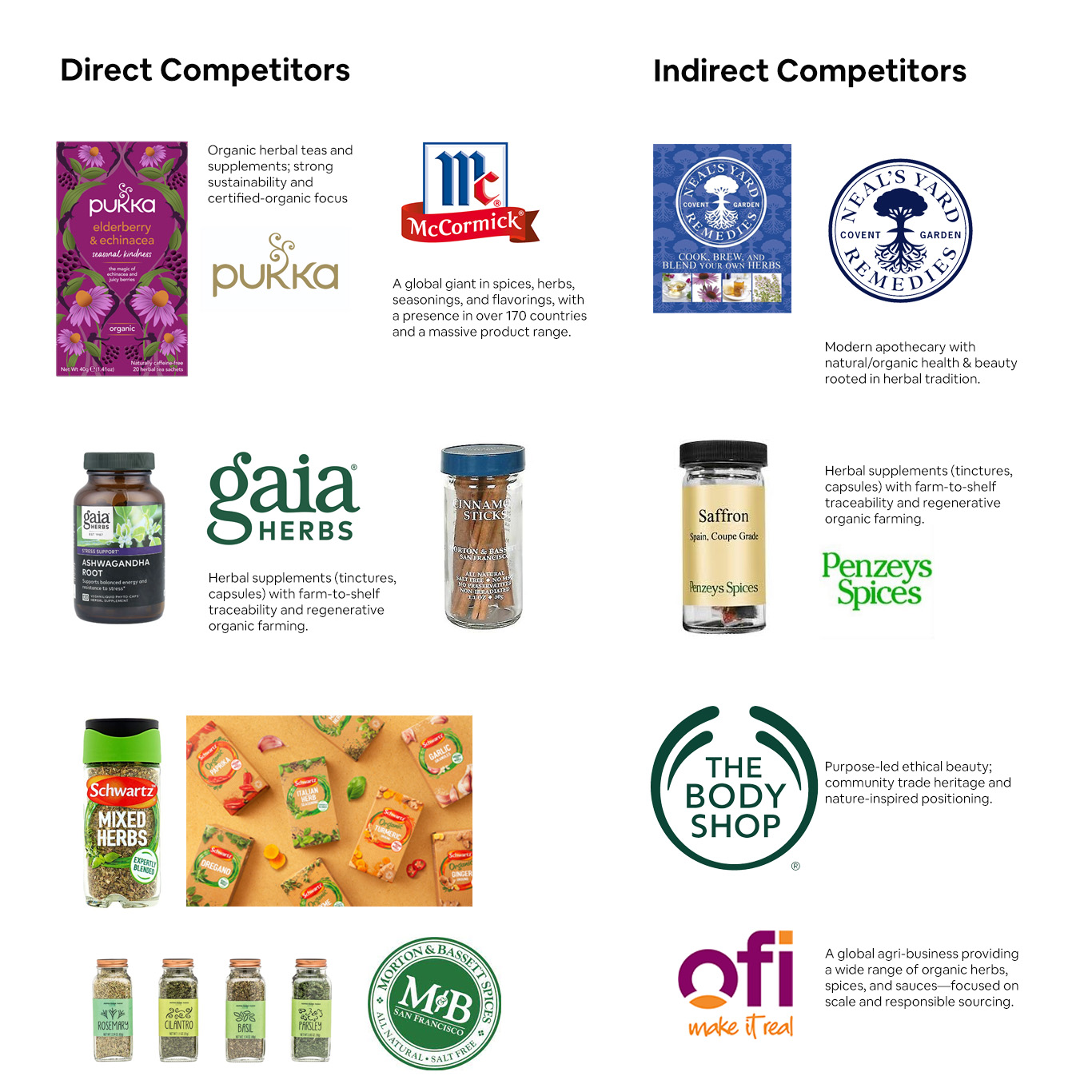
Direct Competitors: These brands focus strongly on supplying herbs and spices as core product lines, many with strong authenticity, provenance, or culinary credibility backing them.
Indirect competitors: These brands aren’t herb-and-spice focused exclusively, but they enter the broader seasoning or flavor category, overlapping consumer expectations around convenience, blends, or culinary inspiration.
Moodboard
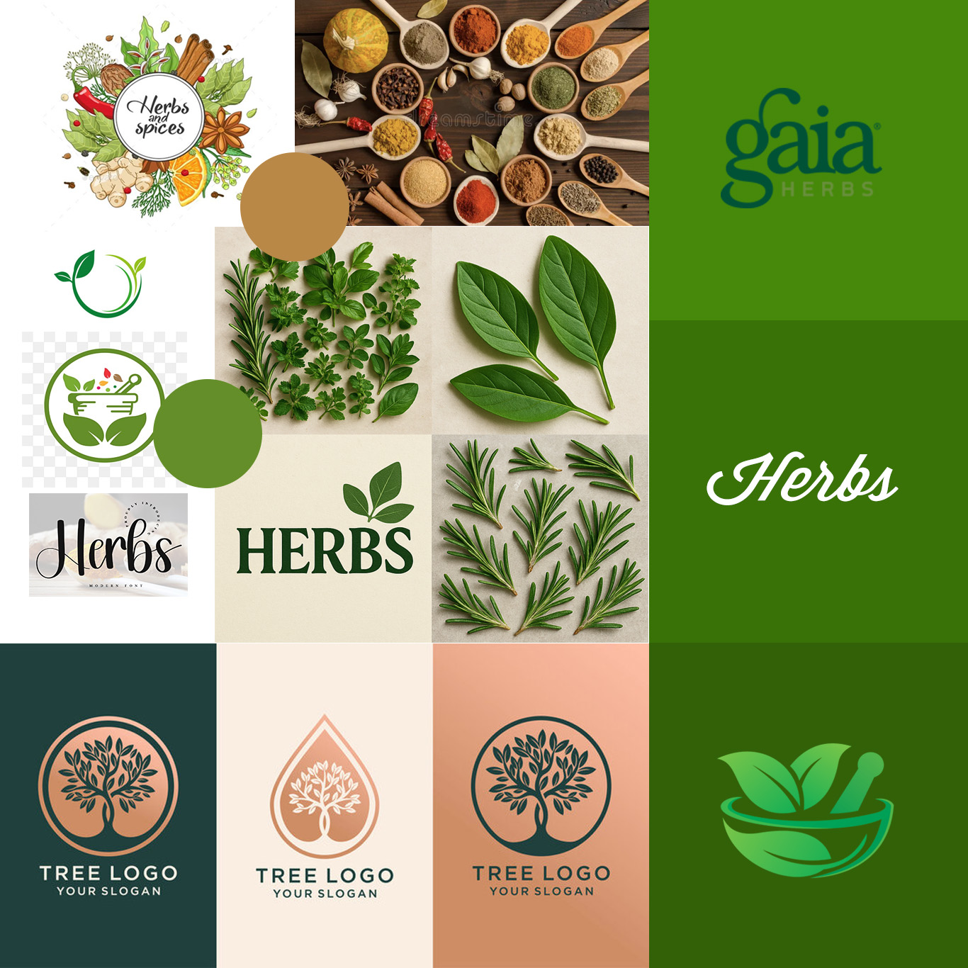
The Herbs moodboard explores natural textures, calming palettes, and organic forms to inspire a sense of freshness and vitality.
Design Process
With the moodboard as a guide, I began experimenting with typography, color palettes, and visual elements that reflected the brand’s herbal roots. Iterations explored both organic and contemporary cues, ensuring flexibility across digital and print applications. The design process was highly collaborative, with feedback loops helping refine the brand identity to align seamlessly with the client’s vision.
Typography
For the Herbs identity, the Continuum typeface was chosen as the primary logotype font. Its clean, geometric sans-serif forms reflect modernity and simplicity, while its subtle rounded edges convey warmth and approachability, qualities central to a wellness and herbal brand. The balance of precision and softness ensures that the logo feels both trustworthy and inviting, bridging the gap between traditional herbal knowledge and contemporary living.
Supporting typefaces were selected to complement Continuum, ensuring a hierarchy that guides the user seamlessly through brand communication, headings remain bold and clear, while body text is approachable and highly legible across digital and print platforms.
Colour Palette
The colour system draws inspiration directly from nature. Earthy greens form the foundation, symbolising growth, balance, and organic freshness. These are paired with muted neutrals to create a sense of calm and clarity, allowing the brand to breathe and feel uncluttered. Accent tones are introduced sparingly, soft herbal hues such as sage and warm terracotta, to highlight key touchpoints and inject vibrancy without overwhelming the overall identity.
The palette was developed with versatility in mind: it feels natural and grounded in packaging applications, while remaining crisp and modern in digital interfaces. Together, the typography and colours establish a consistent, approachable brand personality that resonates with a health-conscious, design-aware audience.
The pairing of earthy brown and natural green creates a cohesive visual language that mirrors the journey of herbs : from soil to sprout. This palette grounds the brand in eco-conscious values while also highlighting freshness and wellbeing, delivering a personality that is both wholesome and contemporary.
Typography
Colour

Typography Rationale
Modern Simplicity: Continuum’s clean, geometric sans-serif form communicates clarity and modernity, ensuring the logo feels fresh and relevant.
Legibility & Versatility: Its strong letterforms ensure readability across scales and mediums, from packaging to digital platforms, while maintaining a distinctive visual character.
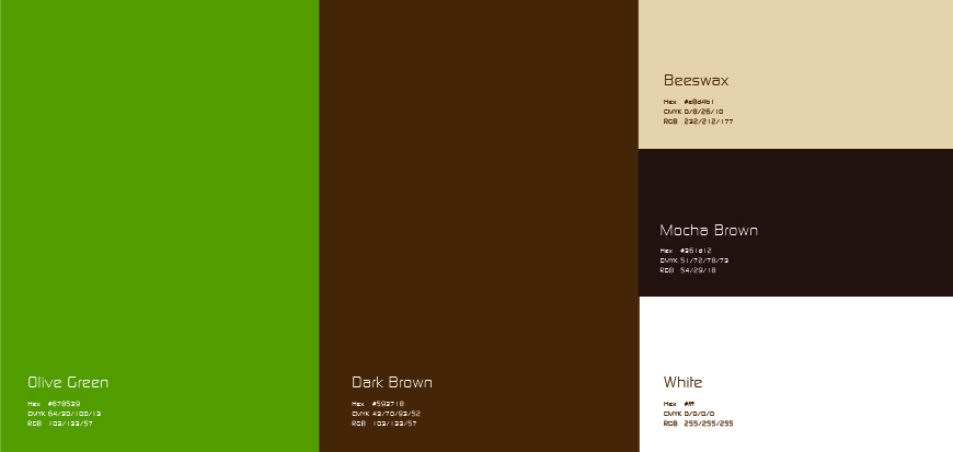
Colour Palette Rationale
For the Herbs project, the colour palette was carefully chosen to reflect the brand’s deep connection to nature, authenticity, and wellbeing. The combination of brown (#593718) and green (#678539) was selected not only for its visual harmony but also for the narrative it conveys about the brand.
Explorations and Iterations
The central idea was fusion in its simplest form, illustrating how flavour and nature come together. The clients wanted to explore the term ‘natural’ with ‘Herbs’
In the exploration stage, I experimented with multiple visual directions:
– Scattering bay leaves around the brand name.
– Forming floral motifs using cumin seeds.
– Using spice textures as abstract patterns.
After many iterations, I realised the most effective approach was also the simplest: integrating leaves directly into the typography. This instantly communicated the natural essence of the brand while keeping the identity sharp and memorable.
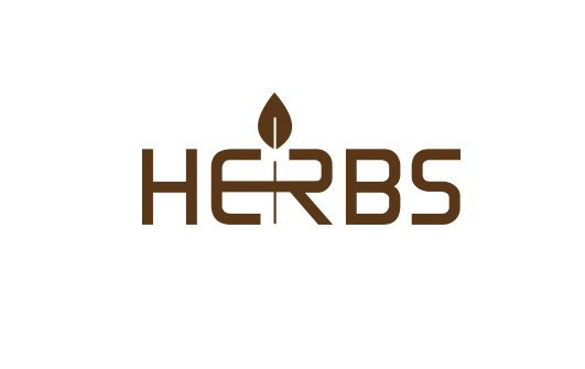
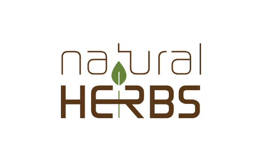
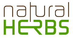
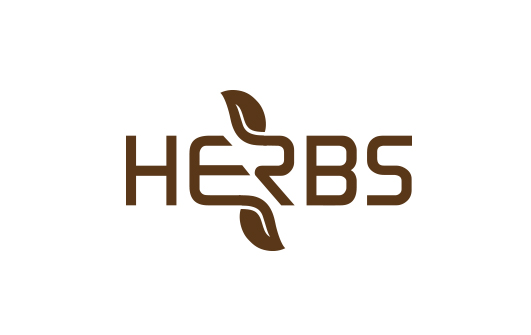
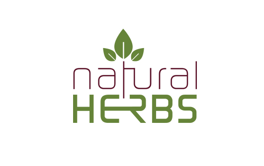

The chosen logo features a bold, modern typeface to ensure clarity and quick recognition. The simplicity of the letterforms makes it relatable, while the subtle leaf accents merge seamlessly into the typography, reinforcing the brand’s natural and flavour-driven roots.


Packaging Design
For packaging, I wanted to carry forward the raw simplicity envisioned during the identity design phase. Each product features:
-
Hand-drawn illustrations of the featured spice (e.g., cinamon, cardamom pods, cloves).
-
Sketch-style linework to evoke authenticity and craftsmanship.
-
Earthy base tones with bright accents for easy differentiation across varieties.
-
Clear hierarchy: bold logo at the top, illustration as the focal point, spice name placed for quick recognition.
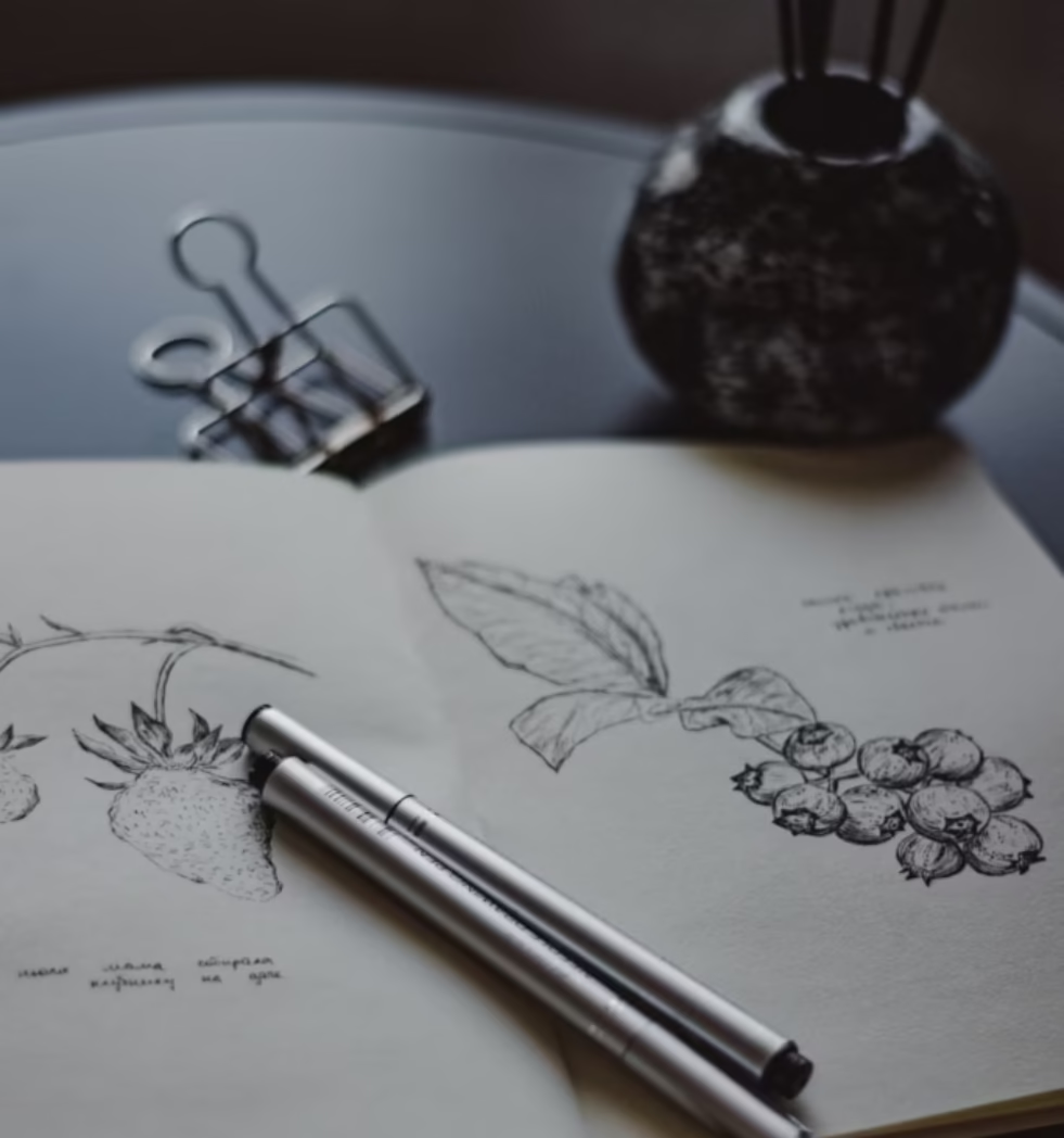
Sketch Style Illustrations


